The following is an academic project. The hypothetical exercise does not represent work for The Schuylkill Center.
PROJECT OVERVIEW
For this project I worked on a team with Rubie Nathanson and Maddie Aubry. We were tasked with redesigning the website of the Schuylkill Center for Environmental Education (SCEE), an organization which focuses on bringing a love of nature to Philadelphia.
USER PERSONA
In the course of researching SCEE we discovered some negative publicity that they had received over the past few years involving employee misconduct at the nature preschool as well as the wildlife center. Because of this, we decided to focus mainly on the user persona of a parent since SCEE would likely need to repair that relationship and reassure them that the center is a safe place to send their children.
BUSY BETTY’S JOURNEY MAP
To help get into the mindset of this user we created a journey map to explore how they interact with SCEE’s website and figure out where pain points exist.
HEURISTIC EVALUATION
Next, we conducted a heuristic evaluation to look at 3 common tasks a user might need to perform on SCEE’s website. Our goal was to look at how intuitive the interaction was and to figure out which areas needed to be improved.
TASK 1: FIGURE OUT WHAT TO DO IF YOU’VE FOUND AN INJURED ANIMAL
There are large blocks of text making it difficult to find specific information.
They use a lot of industry terminology throughout this section which would likely be difficult for the average user to understand especially if they’re looking at the page because of a wildlife emergency.
The lack of imagery in this section could also make it more difficult for users to understand this section. For instance the reptiles page mentions that there are only three venomous snakes in Pennsylvania, but does not show what they look like.
TASK 2: DONATE TO THE WILDLIFE CLINIC
There are a couple places to donate on SCEE’s site but they’re not consistent and one of the pages takes you to another site that doesn’t look very official.
The main donate page has a completely different look than the main site and there’s no way to return to the main site once you get into the donate page.
The donate page itself is poorly structured and does not follow an “F” shaped pattern. The main action item, the donate button, is located in the far bottom right where the user is much less likely to see it.
TASK 3: SIGN UP FOR NATURE PRESCHOOL
The main navigation on the website has an education section but it doesn’t include the nature preschool.
The sign up process is not clear and varies from program to program. In some cases there is an online form while in other’s there is a phone number you need to call which isn’t always listed in the same spot.
CONTENT AUDIT
After running into a lot of clutter while trying to perform the tasks in the heuristic evaluation, we decided to conduct a thorough content audit to get a grasp on all the data that SCEE was trying to squeeze into their website. We split the main navigation between each of us and then went through each page noting all of the content and links on each. We found that many of the sections were redundant and poorly organized. Moving forward we decided that we needed to pare down the site to make it easier for users to find the information they’re looking for.
CARD SORT
After we cut down on the the content on the website to the essentials, we conducted a few rounds of card sorts to start reorganizing the information into more intuitive categories.
To conduct the first few card sorts we created cards for each of the essential pages on the website and then began grouping to figure out which pages should fall under the same category. After a couple rounds we decided on the categories and then moved to closed card sorts where we would bring in outside testers.
The users were given the categories that we had come up with and then asked to place the cards where they thought they should go. This helped us to validate that we were placing these pages in groups that made sense to people other than ourselves.
SITE MAP
The card sorts helped to form the basis of our site map so that we could begin the next round of testing.
TREE TEST
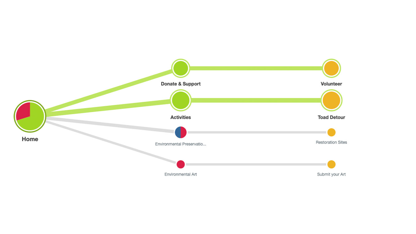
To ensure that our site map was intuitive we decided to do a a few tree tests to make sure the organization of the site was intuitive. We set up tree tests for 4 different tasks and asked our testers to perform them to the best of their ability. We intentionally chose tasks that we had had difficulty placing in the site map to make sure that we had placed them in the most intuitive spots. Most of the tests performed pretty well with the exception of the mailing list. Initially we had it under the news section but after the results of the tree test we moved it to the footer on the home page so it would be more visible.
Where would you go if you wanted to have a birthday party at the Schuylkill Center?
Where would you go if you wanted to volunteer for the Toad Detour?
Where would you go if you found an animal in your yard?
Where would you go to join the mailing list?
FINAL WIREFRAME
We created the final wireframes for our redesign in Adobe XD.


